I took the day to explore downtown Jersey City in hopes of finding a few bars and restaurants that I thought had wonderfully-designed materials. As I began to write this post (which was originally going to include more than one place), I slowly focused in on one bar.
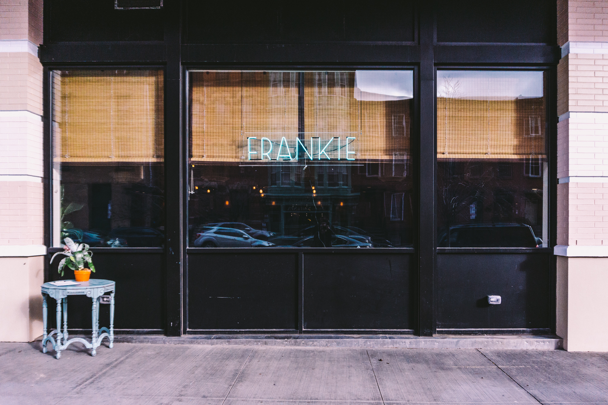
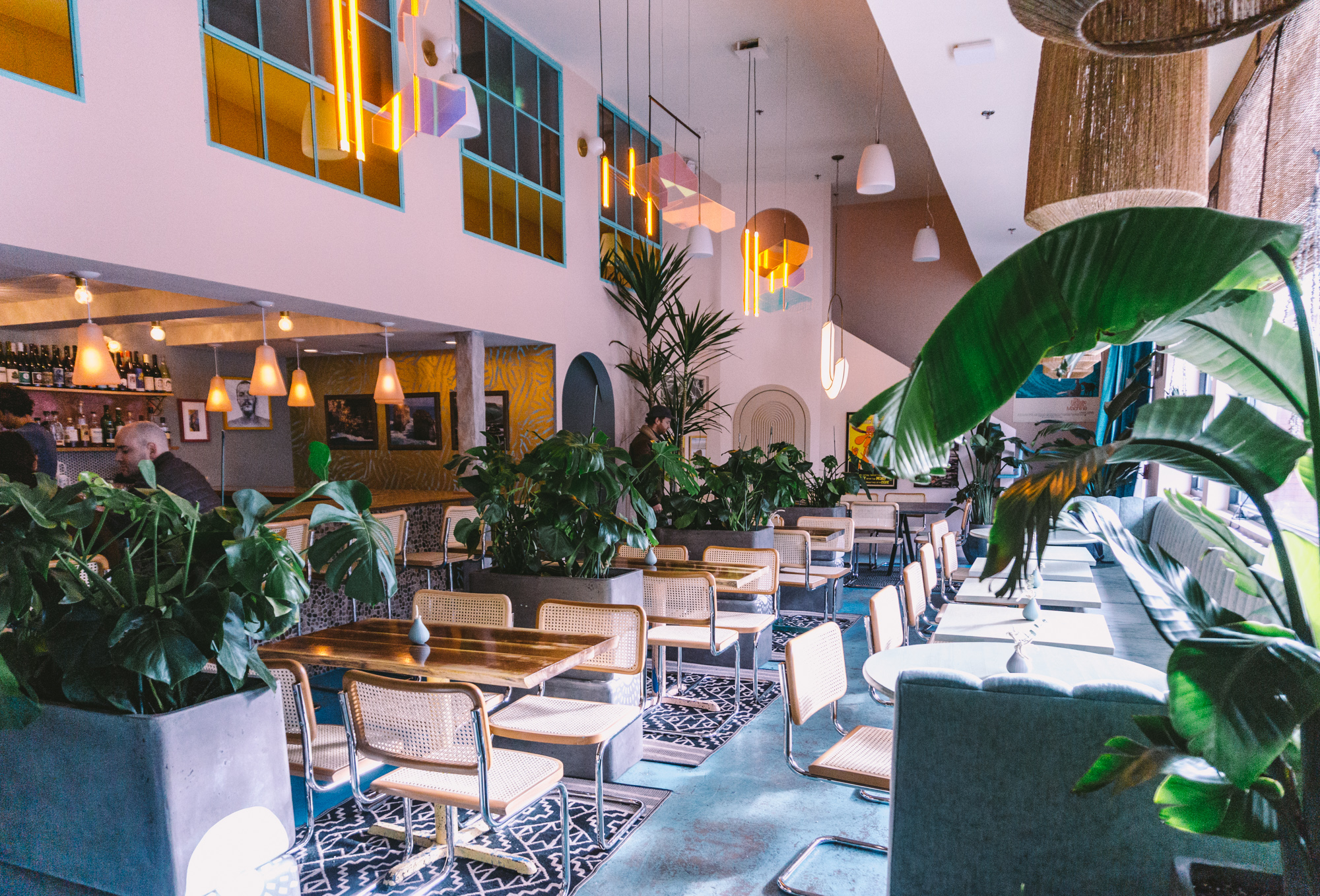
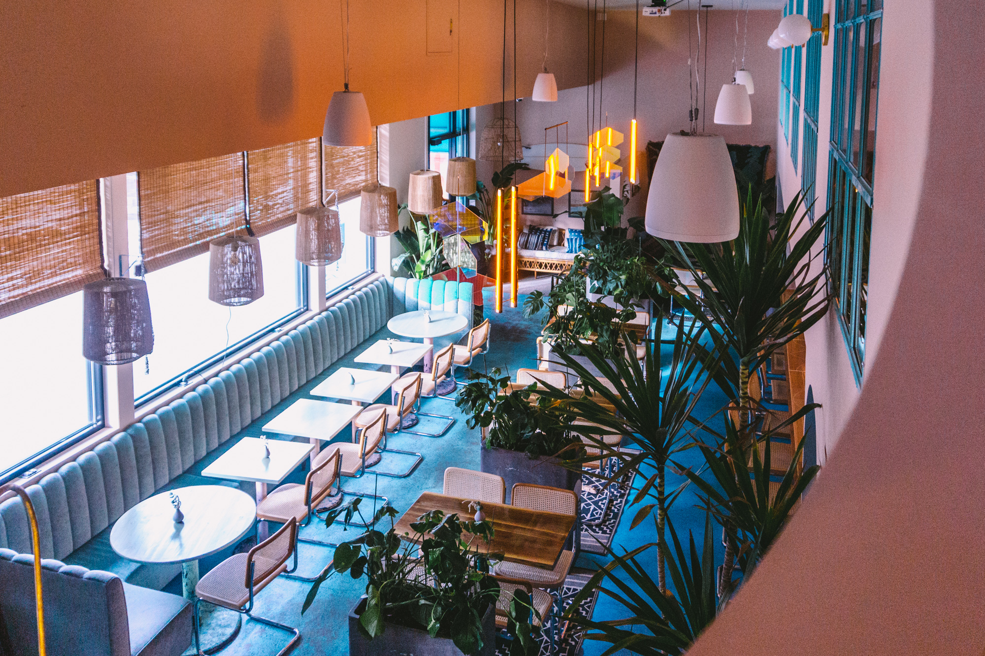
Meet Frankie: a bar/eatery with Australian influence located in downtown Jersey City only a few blocks away from the Grove Street Path. Designed by Rebecca Johnson, it is now my new favorite spot. You’ll start to understand when you see the bamboo shades and gorgeous neon ‘Frankie’ sign in the front window. When you walk in you’re welcomed into the space by lush tropical plants, pastel pink walls, and high ceilings with plenty of warm light filling the space. I felt like I was transported to Australia. I have never been before, but I would now love to go.
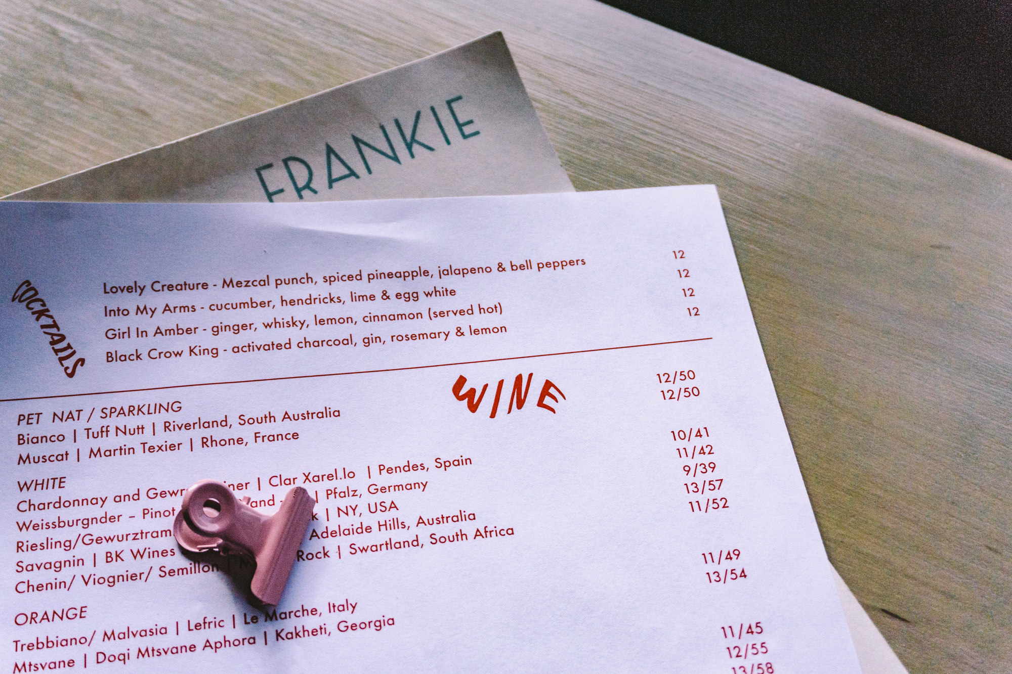
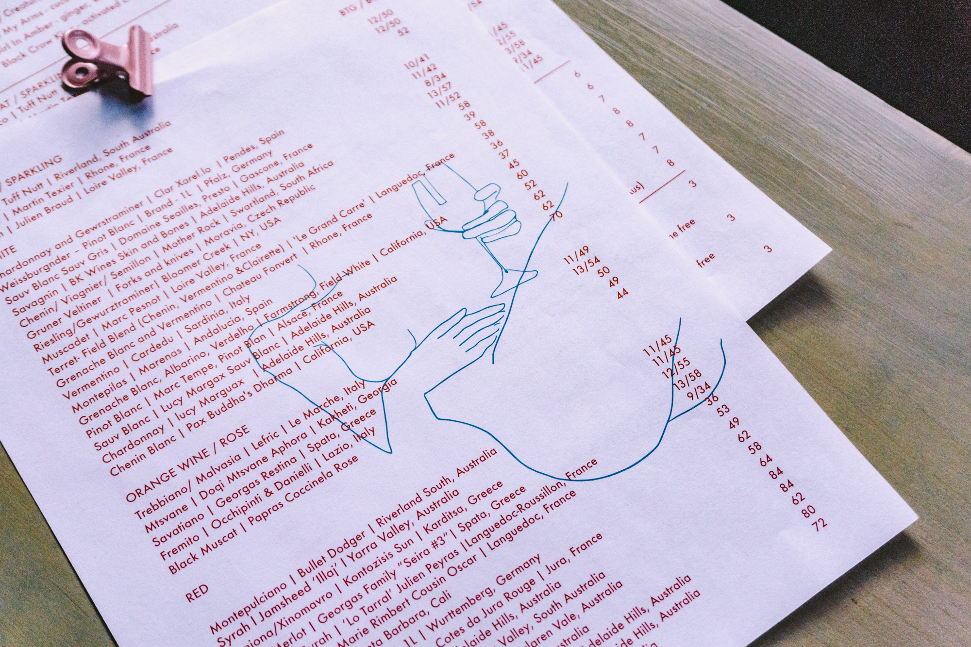
I made my way to the bar and ordered an espresso. While I waited, I picked up a menu and began my observation. The menu was three pieces of paper held together by a small pastel pink clip that matched the walls. I really appreciate the attention to detail on this element as it could’ve been easily overlooked. The first page was a thicker stock and printed in a dark shade of blue. It included all of the food and was divided into sections such as small plates, flatbreads, and large plates. Each section header was labeled using a brush script font and warped as if it was a liquid dripping down the page.
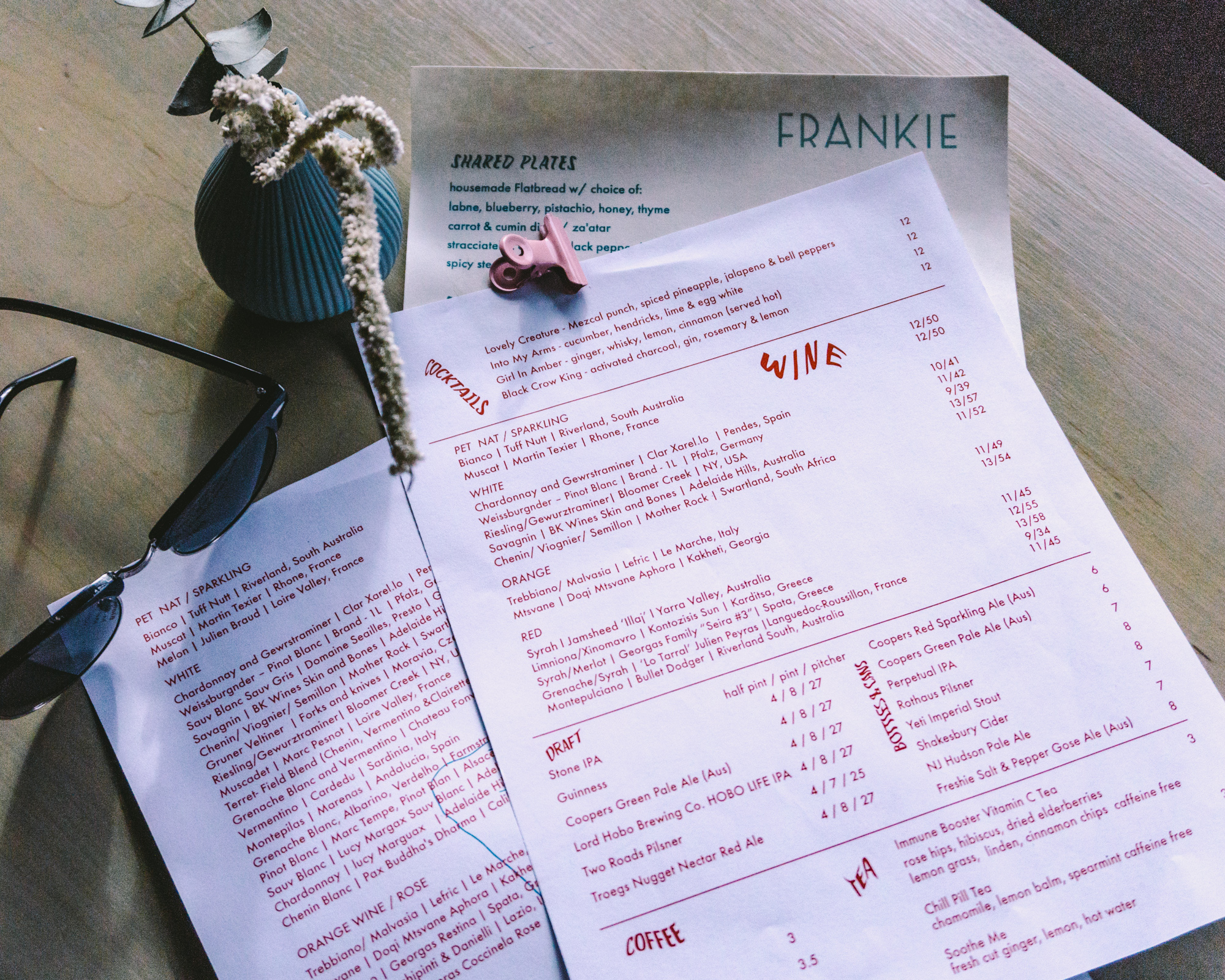
The rest of the menu used the typeface Futura. The other two pages of the menu were for wine and cocktails and printed on white printer paper. I imagine this menu changes frequently as they rotate their selection seasonally. The cocktail menu switches between one and two columns using a thin border to separate the sections. The labels on this menu are scattered and rotated throughout the page filling in the negative space and creating a snaked path for your eyes to navigate.
On the second page of the drink menu is a blue line drawing of a female body holding a wine glass. The image recedes under the lists of natural wines that are printed in red. Simple in its execution of color and type, it is very legible. I love the smaller details like the warped headings and promiscuous illustration. Overall, the menu is very well done.
After my espresso and a lovely conversation with some others at the bar I wandered around. Vintage surf posters and photographs of the Australian coast are hung throughout the space. Sheets of pink translucent glass dangle down the center of the room and reflect familiar shades of a sky during a sunset. The furniture includes natural wood tables, bamboo metal chairs, and woven lamp shades that extend the feeling of bohemian surf culture.
From the well-designed menu to the bright pastel colors and intricate furnishings throughout, Frankie creates a very distinct and impressive atmosphere that is the direct result of good design consideration. If you’re in the area, I strongly recommend checking it out.
Thanks for reading!
-Jon